Zara Mobile App
Helping customers buy with confidence
I designed a mobile solution to improve the product view page by making it easier for customers to view available product colors, sizes and product reviews to build confidence to purchase a product increasing conversion rates.
My Role
UX Designer
Timeline
April 2025 - Ongoing
Overview
What is this project about?
Zara is one of my favorite brands—I love their clothing. One day, short on time, I tried using their app instead of going to the store, but it was a frustrating experience. The app was hard to navigate, and whenever I tried to view more details on an item, it would switch to a different product. I lost track of the jacket I liked and gave up. The next day, I went to the store, only to find out it was online-only. I couldn’t help but wonder if others have had the same problem.
That moment sparked the start of this project!
The Problem
"Too frustrating to use. Couldn't find my size. I ended up going to the store."
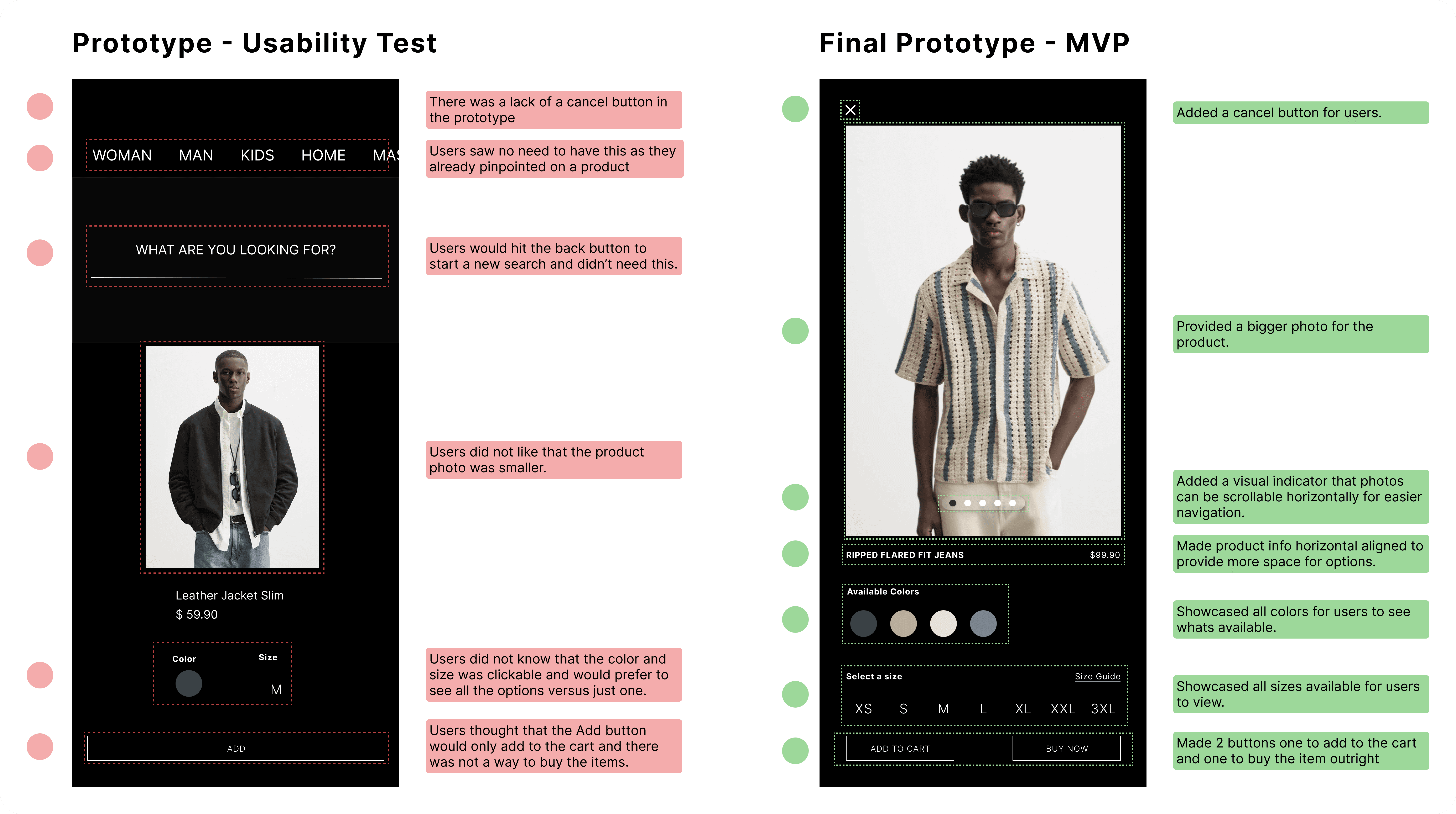
The Zara app is difficult to navigate, with a confusing layout and flow that often frustrate users. This poor user experience leads many customers to abandon the app without completing their purchases, leaving items behind in their carts
The Solution
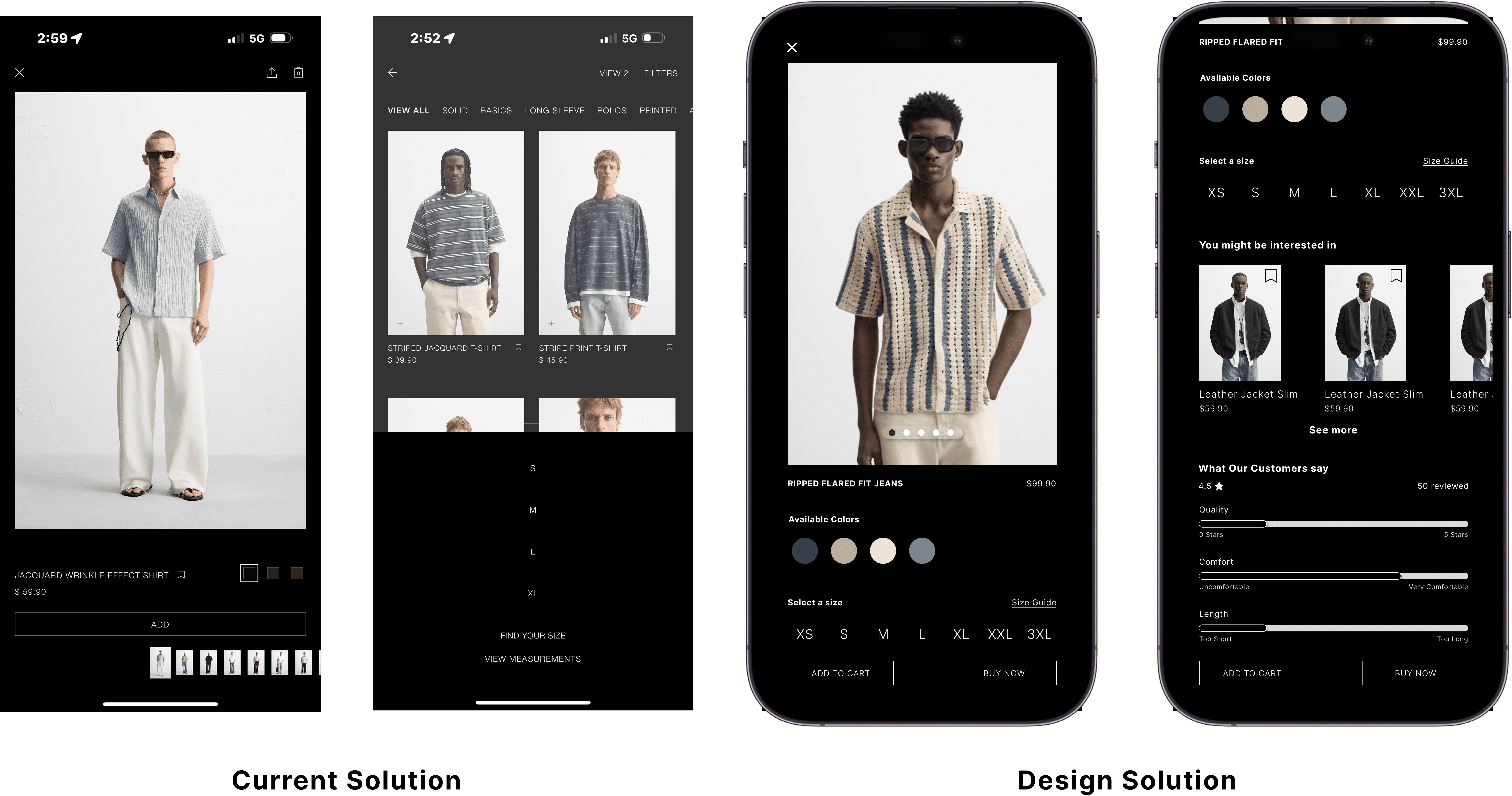
Streamline customer paths to product info
There are too many paths a customer goes through when viewing product information. The design solution will create a structured flow for customers to easily access and view information without lost or confused.
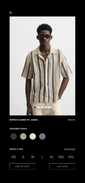
Horizontal Scrolling for product photos
Users can quickly scan through multiple photos horizontally.
Providing product options to users
The options are provided right there to easily find and locate their product preferences.

Customer reviews
This adds social proof from past customers that liked the product creating more confidence to purchase.

My Process
Research
Understanding users
User Interviews
I interviewed 10 customers and wanted to know what their experience was like using the application from what they liked and what they disliked about the app. The point of the interviews was to better understand where the user is coming from when using the app as they are the ones using the application.
Findings
"Lost is an understatement. I can't find information."
Users would often get lost when navigating through the app. They would try to use gestures or functions that they expect to work but created frustration and confusing.
"I don't see where to select my size?"
Among users the navigation could definitely be improved, however the biggest issue for users was that they could not find a size option which often led to frustration and just gave up on the purchase altogether.
"Feels like i'm doomscrolling when I'm looking at a product photos."
When users are scrolling through a product they felt annoyed or anxious because they couldn't find what they were looking for.
Secondary Research
Confirming the problem
I wanted to make sure that this was not an issue amongst a small number of users and decided to do some secondary research by reading through some user feedback on the Zara app. This is what I found based on recent reviews from users.
Define
Pinpointing the issues
I analyzed the data gathered and focused on solving these issues below.
Swiping left or right changes product
Users swipe left or right expecting to see different photos of the product. But in this instance it changes the product entirely.

Hidden size options
Users scroll and are not able to find the size options of the product.

Endless vertical scrolling
Users scroll through many photos of the product and it takes forever to see product information.

Ideation
How Might We Statements
Based on the pain points mentioned above. I created how might we statements to help brainstorm creative opportunities to solve the issues mentioned when creating wireframes.
Wireframes
I did a "bonkers 4s" a spin off of the crazy 8s rapid ideation technique to ideate various wireframes before settling for Wireframe 4 to prototype for users to get feedback.
Develop
Usability Testing
I performed a task based usability test with 10 users to see if they could finish simple tasks when using the prototype.
New Opportunity!
During usability testing users provided insight on the Add button was not the same a Buy button. 8/10 users were looking for the Buy button and not the Add button. After further testing I decided to remove ambiguity and add two buttons a Add to Cart button and a Buy Now button.
MVP
Next Steps
Getting statistics to further validate my solution
After receiving feedback from the usability test, I iterated and improved the upon the prototype. The next thing I want to do is to get statistics to further validate the solution by doing an A/B usability test with the current version and my solution in terms of purchase conversions.
Preparing for Dev Handoff
I would then start to document, redline and annotate my designs to devs for handoff.
Reflection
What did I learn?
Users can definitely pivot you into a new perspective that as a designer is refreshing in terms of learning new interactions and different ways of thinking. Although users feedback varies there is valuable information for the most part.
Future plans?
I would want to incorporate and improve Zara's user of AI with the mobile app to provide users with clothing options or style tips when purchasing clothes, or the ability to make suggestions and provide clothe choices based on their preferences.
Next Project