SAP Meeting Room Checker
Enhancing Meeting Room Check Efficiency
I designed a solution that removed ambiguous information, eliminated redundant actions users take to access meeting room timestamp information and improved the filter process to find specific rooms. I collaborated with technicians and engineers for this project.
My Role
UX Designer
Timeline
Februrary 2025 - Ongoing
Overview
What is this project about?
After a colleague voiced frustration with a web app for managing meeting room compliance, I empathized—having faced the same issue before in a prior role. This shared challenge motivated me to start a project to streamline the process.
The Problem
"Techs are not completing meeting checks on time."
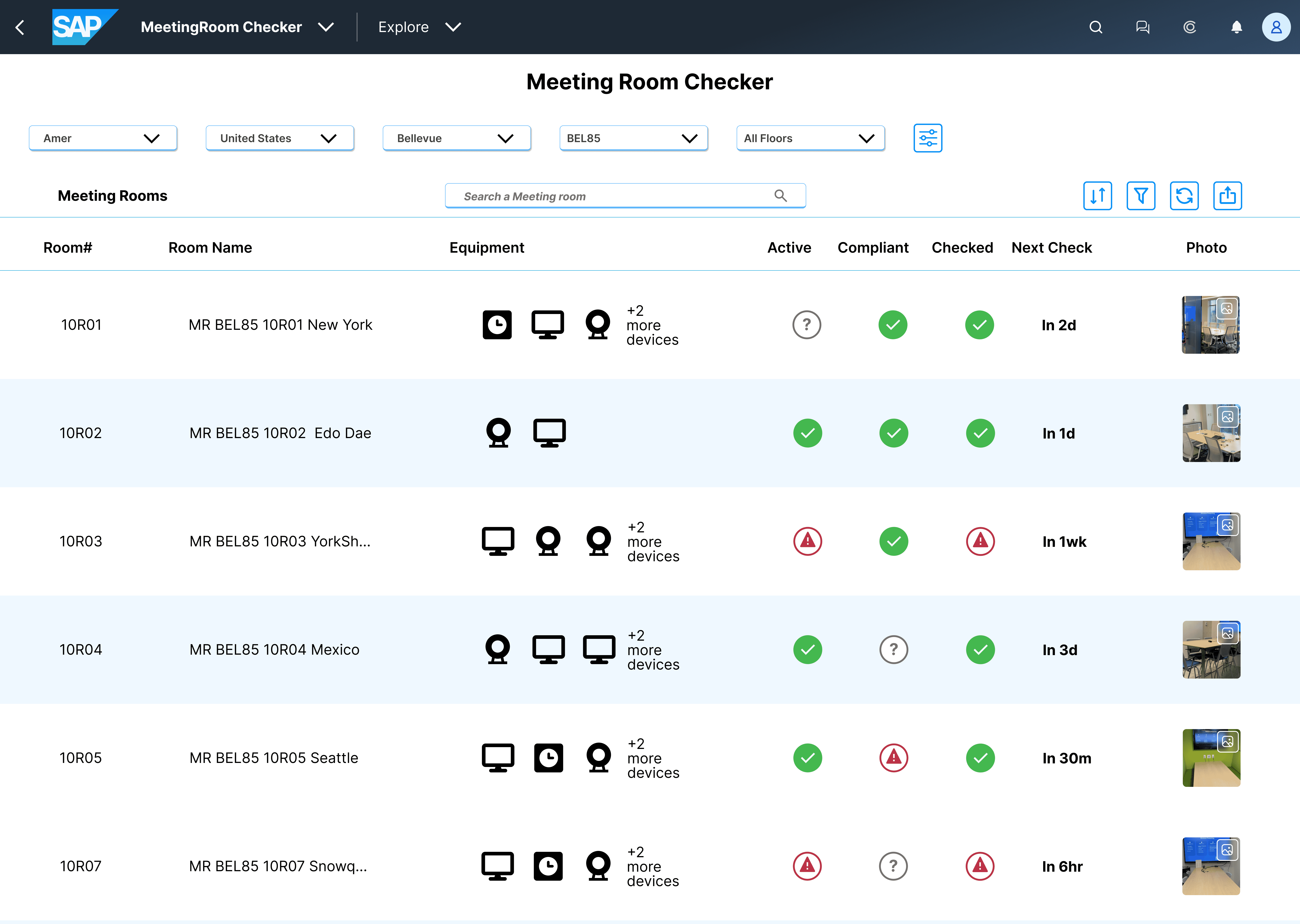
The IT team checks hundreds of meeting rooms daily to meet service agreements and avoid penalties. However, the filter button only shows overdue rooms or none at all, suggesting no action is needed. Technicians must click through several prompts to view timestamps and return, making the process slow and repetitive.
The Solution
"Remove columns with irrelevant info, add a time count column of when to check rooms & reword filter options."
My Process
Research
Understanding the users
User Interviews - What they say
I interviewed 4 IT technicians that had access to the Meeting Room Checker application to empathize and understand their process when checking meeting rooms.
User Observations - What they actually do
I wanted to observe how technicians interact with the application. I observed technicians using the app by having them share their screen from the start of their shift, allowing natural interaction. I noted pain points and sorted findings.
Define
Analyzing the information
I took all the information gathered, analyzed and focused on these issues.
Redundant information
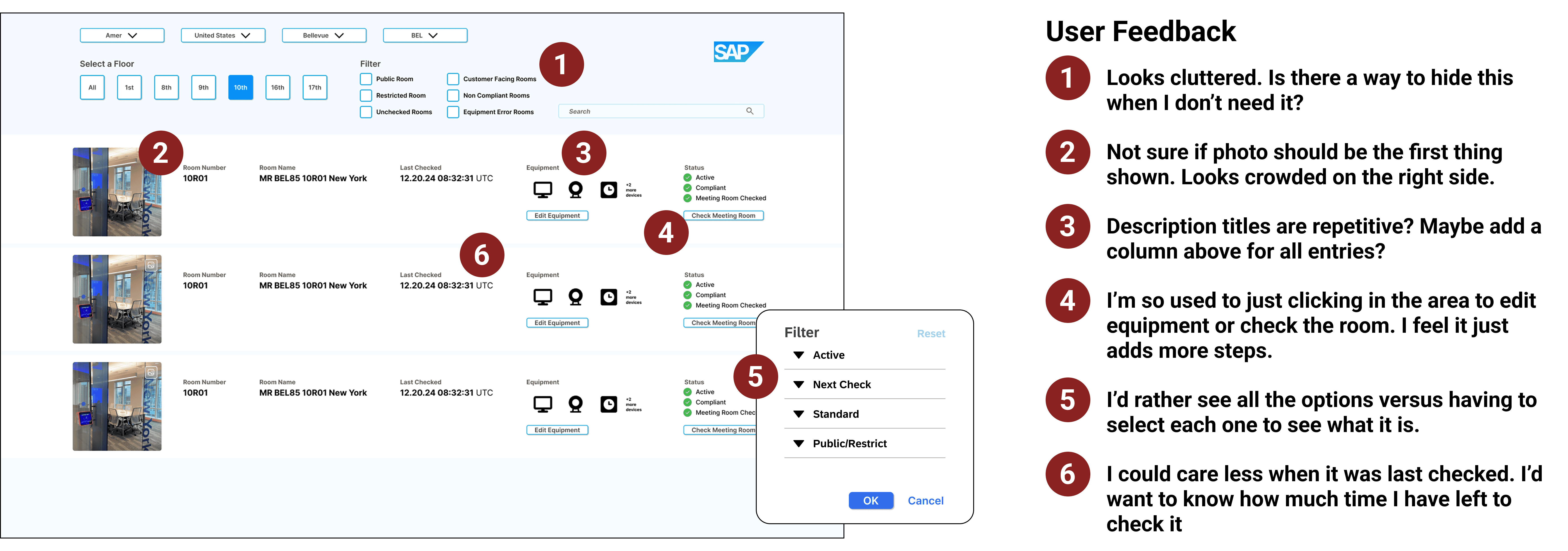
There is a lot of redundant information in the main list that takes up a large amount of space that could be replaced with more relevant information that technicians can use.
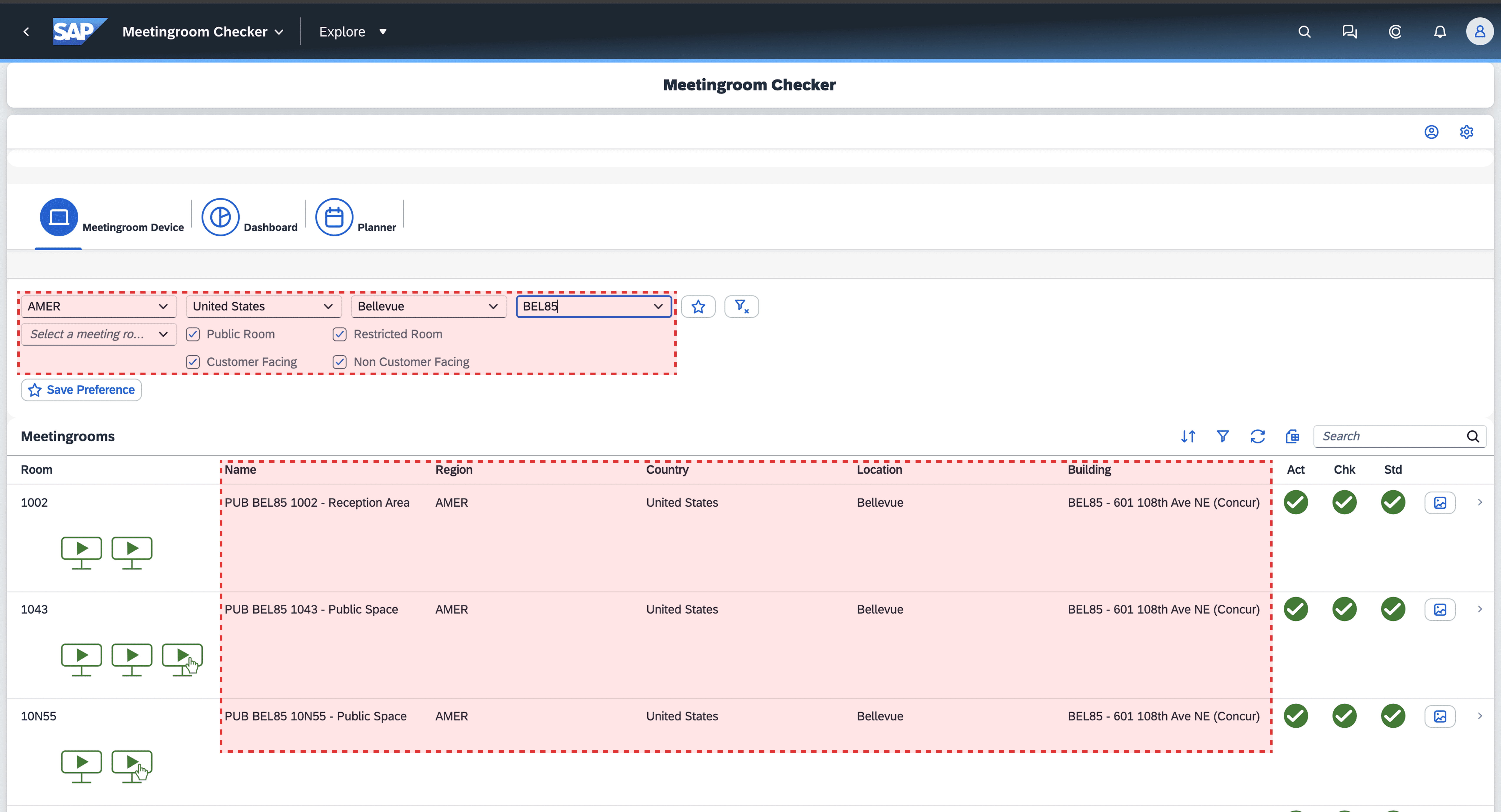
Too many clicks to get specific info
To see the last checked time of a meeting room, a technician must go through a total of 7 screens and prompts. 4 clicks to view the information and return back to the main list. Keep in mind technicians have to check hundreds of rooms daily with this process.

The filter feature output is off
The filter categories are ambiguous, and regardless of the selected option, the result either shows meeting rooms that have already exceeded the required check time or no meeting rooms at all.

Ideation
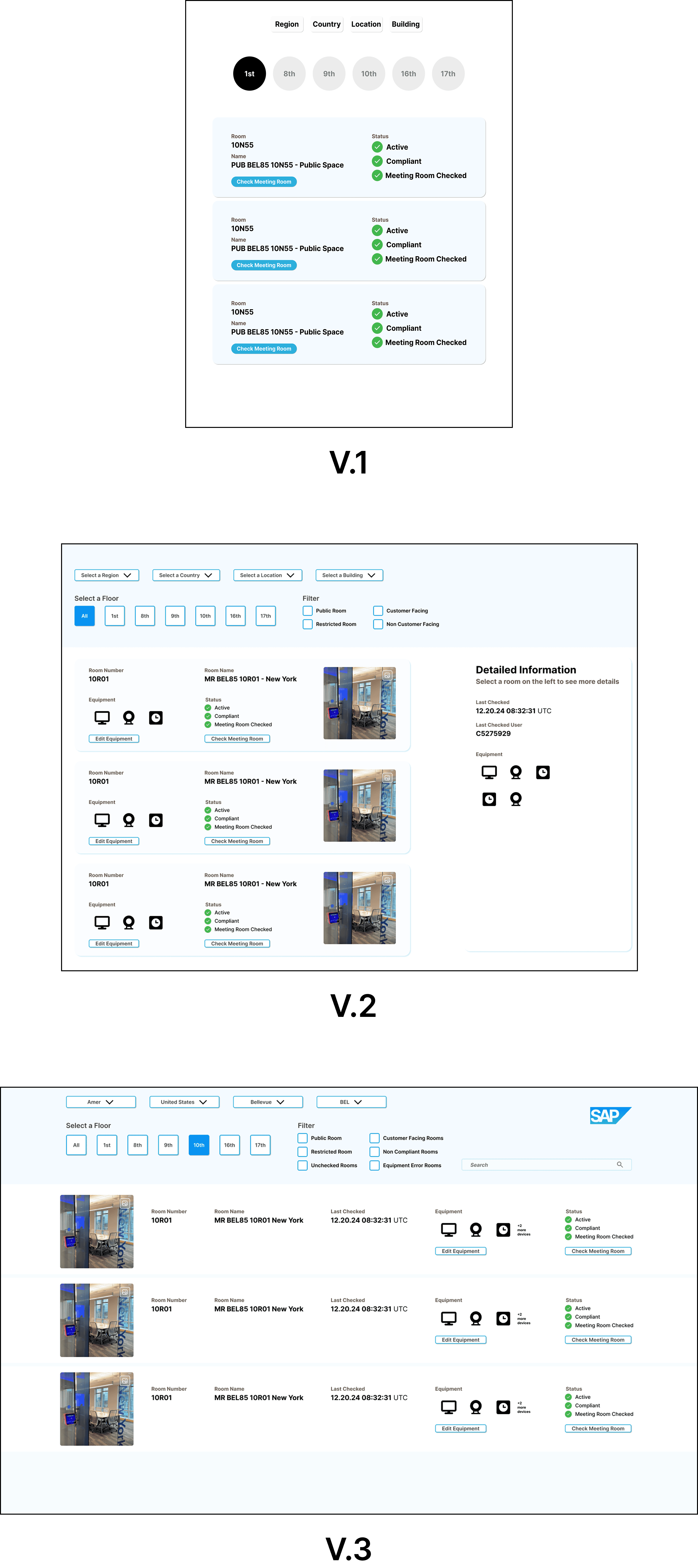
Concept Testing
I created 3 versions before settling on a prototype with technicians to test. The reason for concept testing was to get valuable feedback from users early on before finalizing on the first prototype to reduce the risk of creating a solution that didn't work for users.
Wireframes
Develop
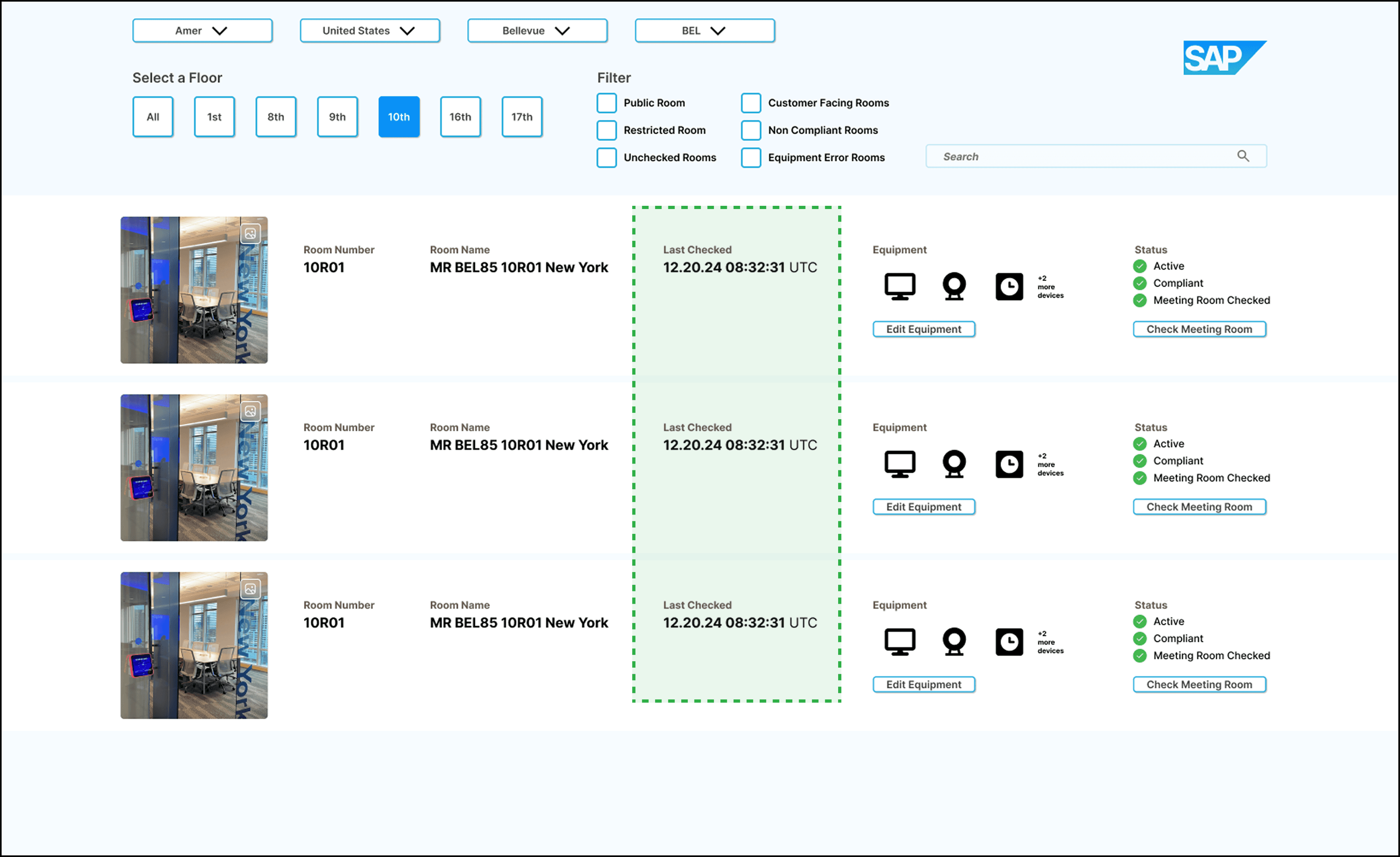
Reducing redundant clicks and actions
My plan was to streamline the interface by removing 4 irrelevant columns and adding a time stamp column for easier scanning.
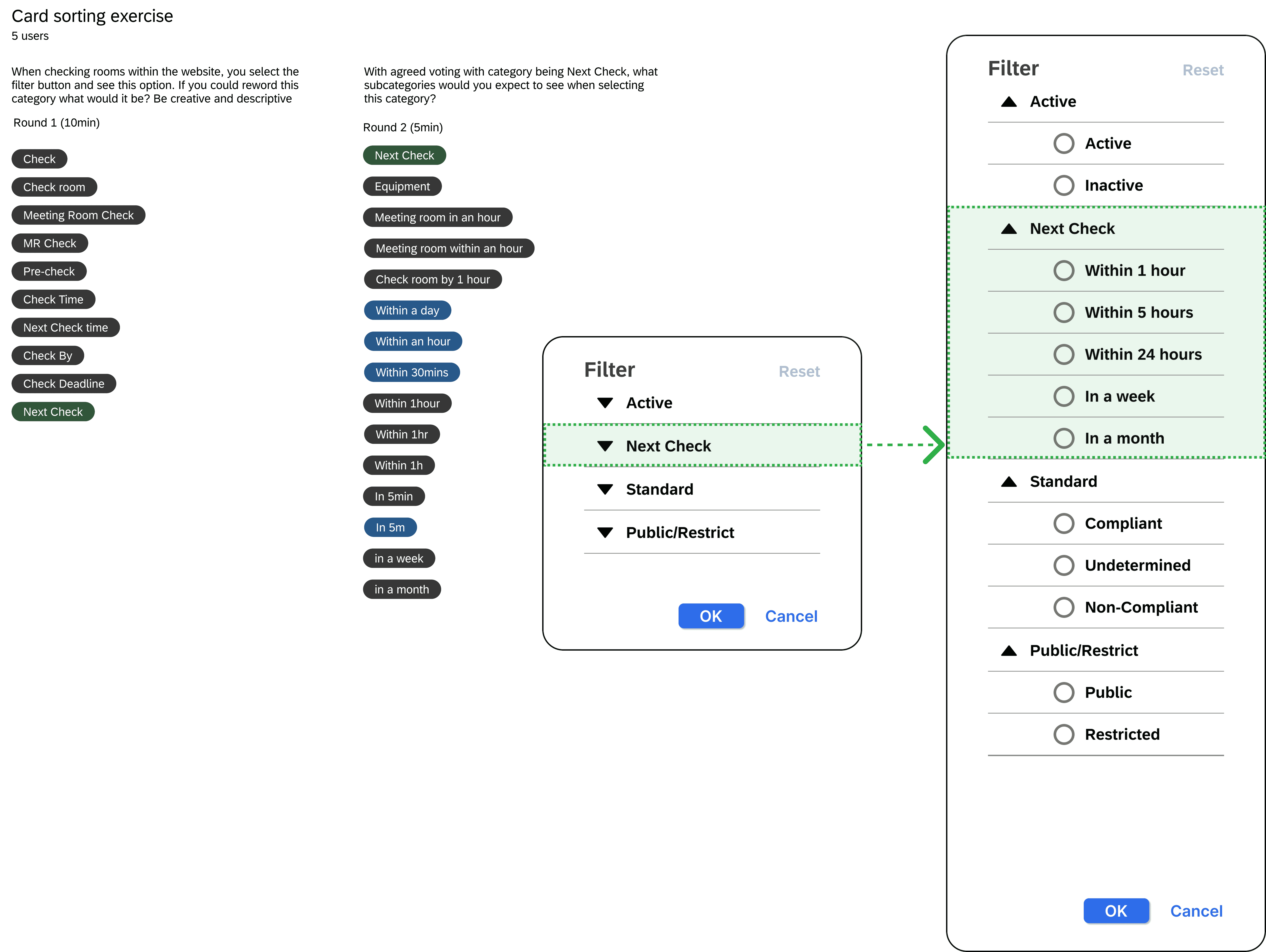
To enhance filtering, I conducted a card sorting exercise to help technicians identify clear category names. I refined the design over 3 iterations based on user feedback.
Usability Testing
The feedback was mostly negative as they focused on visual changes rather than functionality.
Although I'd conduct more testing before making visual changes, I treated the users as stakeholders for this project as they were the ones actively using the application. I used this as an opportunity to collaborate with them further.
Time Stamp column
I removed unnecessary columns to give technicians desired information of when room was last checked and added spacing to give the info room to breathe.
Filter category expands
I conducted two rounds of card sorting to choose clear category names for filtering rooms, with users selecting terms for both parent and subcategories. This gives users words they understand and expect to see when selecting specific categories. The top choices were used in my design.
Final Design Solution
"This would open up my workflow so much."
Although I'd conduct more testing before making visual changes, I treated the users as stakeholders for this project as they were the ones actively using the application. I used this as an opportunity to collaborate with them further.
MVP

New Opportunity!
Users preferred to see how much time they needed to check a room and not when it was last checked. I went ahead and added those changes in the final prototype.
Changes
Reverted the way the information was formatted as it was a format that users were familiar with.
Organized column order prioritizing information that technicians were used to viewing.
Added a time column of when the room needs to be checked by.
Filter categories will show all subcategories at start when filter button is clicked.
Next Steps
Getting statistics to further validate my solution
After receiving feedback from the usability test, I iterated and improved the upon the prototype. The next thing I want to do is to get statistics to further validate the solution by doing an A/B usability test with the current version and my solution in terms of purchase conversions.
Preparing for Dev Handoff
I would then start to document, redline and annotate my designs to a dev.
Reflection
What impact did it have?
It has raised awareness of the issues the current application has.With the current prototype I performed a task based usability test and based on the time study there was a 75% reduction in completion task time.
What did I learn?
I learned during my research that users often say one thing but behave differently. I noticed this in interviews and observations, so I focused more on their actions, especially how they interact with apps.
What do I plan to do next?
Improve the prototype and test if users can complete tasks independently. I would like to conduct an A/B test to compare time spent locating rooms on the current site versus my solution.
Future plans?
I plan to add snack bar notifications to subtly confirm users' actions, ensuring they know their input was received and preventing confusion.
Next Project